 Version 1.0 — 2026
01 — Brand Logo
The mark.
Master logo
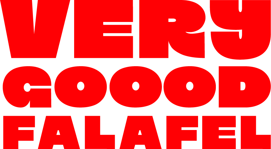
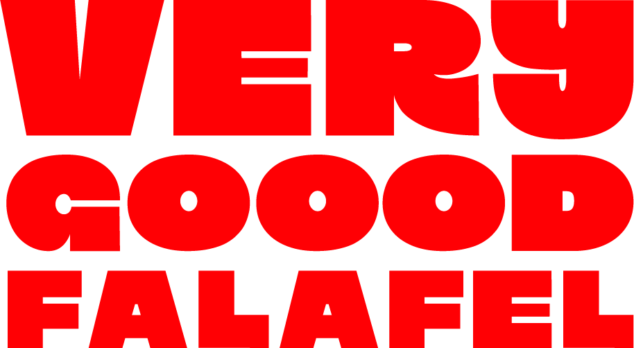
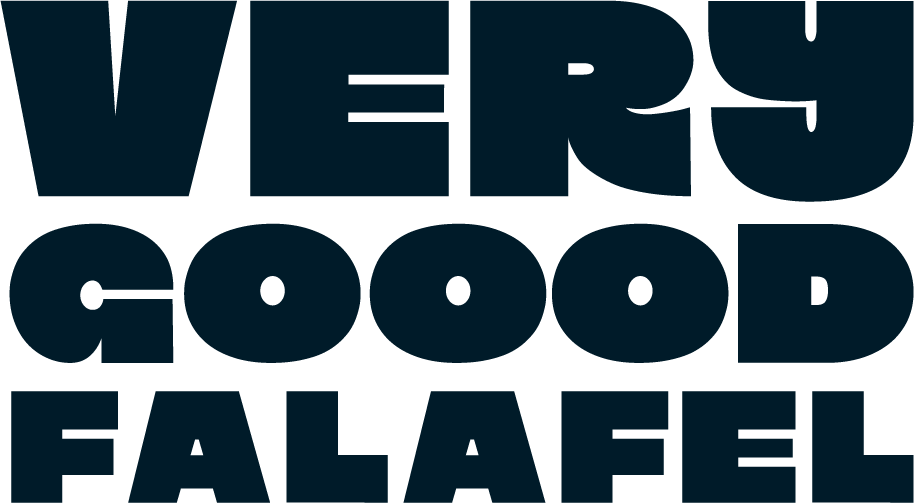
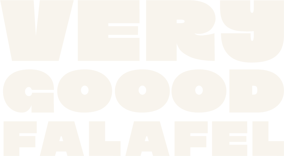
The VGF wordmark is a three-line all-caps stack — VERY / GOOOD / FALAFEL — set in a heavy compressed typeface with custom letterwork. The mark is always set in one of the five brand colours on a contrasting background. It is never redrawn, stretched, or modified.
 Chili on Cream — Primary
 Cream on Coal
 Cream on Chili
 Coal on Curry
 Coal on Chicory
 Chicory on Coal
Typographic signature
The triple-O in GOOOD is the brand's typographic signature — a deliberate repetition that transforms a spelling quirk into a distinctive mark. It is never corrected to two O's. The three O's are the brand.
The custom G carries an extended crossbar that breaks the letterform boundary — a precise detail that signals this is not an off-the-shelf identity. Every character has been considered.
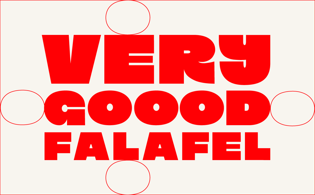
Clearspace
The minimum clearspace is defined by the O letterform itself. Its full height determines the protected zone above and below. Its full width determines the protected zone left and right. No other element may enter this zone at any scale.
What to avoid
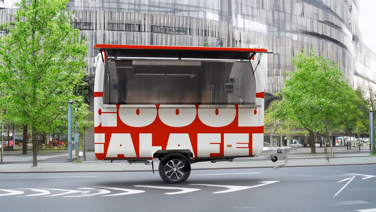
Logo application — mock-up of trailer without signage
VGF — 2026
02 — Colour Palette
Five colours.
No more.
The palette
The VGF palette is not purely decorative. Each colour was chosen because it carries a specific visual meaning that reinforces who we are: life-loving, positive, confident, and modern without chasing trends. The five colours work in tension and in harmony. They are the only colours ever used.
Approved colour combinations
Chili always appears on Cream as its primary pairing. All combinations are chosen for contrast and coherence. Unapproved pairings must not be used.
Chili on Cream — Primary
Chili on Cream — Reversed
Cream on Coal
Coal on Curry
Coal on Chicory
Chicory on Coal — Digital
Curry on Coal — Campaign
Coal on Cream — Text
03 — Typography
Aeonik.
One typeface.
Primary typeface — Aeonik by CoType Foundry
Aeonik is a neo-grotesque with a geometric skeleton — precise, warm, and built for scale. It was chosen for VGF because it carries both the public brand voice and the internal platform system without compromise: confident enough for a franchise pitch deck, warm enough for a street food menu, legible enough for a kiosk at two metres.
The superfamily — Standard, Condensed, Extended, Mono, and Fono — gives VGF a complete typographic system from a single source. One foundry, one design sensibility, every context covered. Aeonik supports over 340 languages including Latin Extended, Cyrillic, Greek, Arabic, Thai, Hebrew, and Hangul.
↗ License Aeonik at cotypefoundry.comType scale
Weight system
Sub-family usage
Aeonik
Brand, website, print, pitch
All public-facing communication. The primary voice across every medium.
Aeonik Condensed
Kiosk UI, tight labels, signage
Where horizontal space is constrained — kiosk screens, packaging labels, in-store signage.
Aeonik Mono
Platform UI, analytics, codes
Partner portal data tables, transaction references, order codes, monospaced contexts.
Aeonik Fono
Footnotes, legal, captions
Small-size utility contexts where standard Aeonik would feel too heavy. Disclaimers, fine print.
04 — Spacing & Layout
The grid.
Spacing unit — 8px base
All spacing in the VGF system is built on an 8px base unit. Margins, padding, gaps, and layout values are always multiples of 8. This creates consistent visual rhythm across digital and print contexts.
Base — 8px
8px
Micro — icon padding, input borders, dividers
Small — 16px
16px
Component internal padding, tight groupings
Medium — 32px
32px
Section gaps, card padding, standard layout
Large — 64px
64px
Section margins, page-level rhythm, hero spacing
Page margins
Website desktop
72px
Gutter each side
Mobile
24px
Side margin
Print A4
20mm
All sides
Max content width
1280px
Container
05 — Photography
Real.
Unposed.
Warm.
Style direction — confirmed
VGF photography is analogue in spirit. Warm tones, natural light, genuine moments. A light film grain is always present — not as a filter effect, but as a quality of the image itself. It signals authenticity, care, and a preference for the real over the polished.
For food photography — particularly posters and campaign material — a direct harsh flash is appropriate and welcome. Unfiltered and immediate, it makes food look like exactly what it is: something worth eating right now. This approach sits naturally alongside the brand's confidence and refuses to make street food look like it needs explaining.
The photography palette mirrors the brand: warm creams, deep shadows, pops of red and amber. Cool, blue, or purple-filtered imagery is never used.
Section in progress
Full photography direction TBC
Detailed art direction — category breakdown, shot lists, approved references, and do/don't examples — will be added once direction is finalised.
Always present
Analogue spirit. Warm tones. Natural light. Light film grain. Genuine unposed moments.
Food / Campaign
Direct harsh flash welcome — unfiltered, immediate, appetite-driven. For food, posters, and campaign work.
Never
Cool, blue, or purple-filtered images. Heavy post-processing. Stock photography. Artificial HDR.
06 — Tone of Voice
Warm.
Direct.
Confident.
Direction confirmed — detail in progress
The VGF voice is warm, grounded, and slightly cheeky. It does not use corporate language, hollow enthusiasm, or sentences that explain rather than demonstrate. Every word earns its place.
Detailed principles, example pairs, and platform-specific guidance will be added once voice direction is finalised.
Section in progress
Full tone of voice guide TBC
Principles, example pairs, platform-specific guidance, and naming conventions will be added in the next version.
Confirmed
Warm, direct, confident. Slightly cheeky. Short sentences. No padding. Clean punctuation.
Never use
Synergy, leverage, seamless, best-in-class, innovative, or any corporate filler phrase.
Punctuation
No long dashes. Short dashes, commas, or restructure. Punctuation serves clarity, not effect.
07 — Applications
In the world.
Section in progress
Applications — TBC
Website, social, print, merch, kiosk, and franchise materials will be documented here once application templates are finalised.